The assignment is to listen to a song, and to paint whatever comes to mind. I am not able to paint actual objects. Instead, I need to paint lines, and use colors that go well with the song; for example, a happy song would use warm colors. I'll succeed by painting the feelings of the song, rather than objects.  This is a practice sketch that I created using one of Mr. Meserve's song he played. The song was a mixing of both light and dark feelings, so I used all colors. It wasn't a smooth tune either, which is why I painted lines that were wiggly or jagged. I could improve by filling up more of the white areas, and also, by blending the colors more, instead of leaving them in their own area.
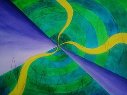 This is my final, and I created it with the instumental version of the song, Sail by Awolnation. The song had mostly a darker feel to it, though there were some parts that lifted up a bit, hence the cool colors, besides the yellow curved lines. Also, the music was pretty soothing, except for a couple of movements, which is why I added the zig-zag lines. The purple shades striking out from the center create a smooth, but sharp look. Also, the swirl to the center represents how the song captures you.. This was my first sketch (I lost the paper I drew it on), and I really like this creation and think it is very successful.
Calligram prints are prints of an image that are created by the use of words. The goal for this assignment is to create a calligram print that will be easy for a viewer to understand, and to use a good amount of ink as to not have too little or too much. 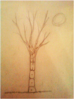 This was my first draft. I was trying to think of common sayings, and my friend thought of this, "knock on wood". It's kind of hard to read "knock" because its so squished together. I also decided to switch my design because I wanted it to be my own creation.
 This is the sketch I came up with, "city that never sleeps".
Its not that well put to gether because its a draft. I like it because I enjoy the really tall buildings in the cities, with all the windows. Although, my final creation is different; the buildings are seen as if you were about the same hieght, and the windows are only on one side of the building.
Here are some of my best final prints. I could have improved them by the amount of paint I rolled onto my block, You can tell if I used too much or too little paint because you can see the color underneath. Also, I made a mistake in my carving; in the word "sleeps", the first "s" wasn't carved to show the inside of the 3-D letter, so it looks like you can see right through it. But over all, I enjoyed doing this assignment and I think they turned out good. 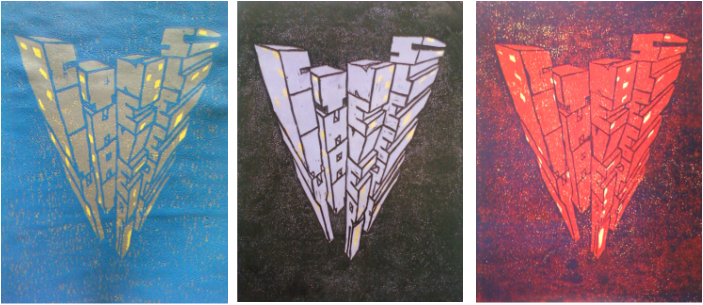 .
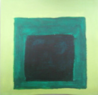
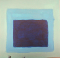
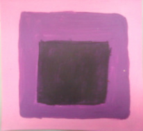
The assignment is to create my own version of an Eyvind Earle painting. The goal is to not copy one of his masterpieces, but using the same techniques he uses. I'll be successful by accomplishing the goals and using small dots to create texture and depth.  This here was my first sketch. I thought of this idea by just going through some of his work, trying to get a feel for what my task was. His work mostly constisted of landscapes and trees. I liked the idea of it, but I felt it was too squished and needed to be changed. So I improved it by making it horizontal, and adding in more objects.
 This is my second sketch, which is also the sketch I used for my final. I added a tree trunk in the foreground, and hills in the background.This looks like Eyvind Earle's work because of the round trees, hills in the background, and the trunk that is in the forground. I definitely like this layout better.
 This is my final piece. While painting it, I had made some changes. The tree trunk only has one limb coming off of it, and there aren't so many trees (I wanted to keep it simpler). I think I could have improved my grass, made it a little darker by the trees to show depth, and maybe added dots as well.This is successful because it's my creation, but it has the technique of Earle, especially with the tree trunk and shape of the trees behind.
This assignment required us to gather three shades of each color of the rainbow, and then to mix paint to create that same shade. After creating each shade, we needed to paint (from light to dark or vise versa, offset squares, which progressively get smaller of each color. 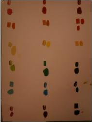 In the photo to the left, you can see the colors I gathered from the magazines and the ones I created to match them. Glare from light made some of the gathered colors appear a little differently, which is the cause of some difference. I wasn’t perfectly exact, but I did get pretty close to the actual color, which is why I believe this was a successful project for me.
 The pink (light red) was created by adding white paint that is about half the size of the red paint. The medium red had just a touch of white mixed in; not much. The dark red contained sienna that was about a fourth the size of the red with just a touch of blue (barely an
 The light orange was created by taking around the same size of sienna and yellow, and addding a very tiny bit of blue. The mediem orange is made from the same color as light orange, but with more sienna and a tiny bit more blue. The dark orange contained light red, red a small amount of sienna and blue for darkness, but only a tiny bit.
 The light yellow was created by adding a lot of white to yellow. The medium yellow just adds a bit of white to yellow paint. The dark yellow is made up of sienna that is about half the size of the yellow paint.
 The light green was created by adding a lot of yellow to green paint. To make the medium green, add a ton of sienna, a tiny bit of yeellow and white, and then very slowly, add blue until desired green is reached. The dark green contains around a fourth of green as turquiose, and a small amount of black.
 The light blue was created by adding white that was about half the size of blue, then add just a touch of green (more if needed). The medium blue had just blue paint and adding white little by little un the desried blue is reached. The dark blue was made up of blue with a little black.
 The light purple is created by adding white that is about half the size of magenta, then adding more if needed. The medium purple contains about the same size of magenta and violet. The dark purple is made from black that is about a third the size of violet, with a small amount of magenta.
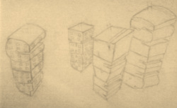
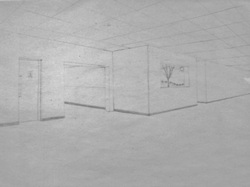
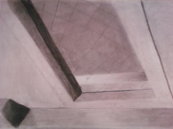
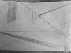
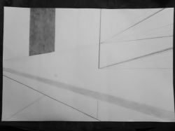
The goal of this project was to recreate a hallway in the school that contained a corner, which would in turn, create a 2-point perspective. To be as successful as possible, the line I drew would have to lead back to the dots drawn, indicating the furthest possible points our eyes can see in our periphrial vision. This will also create depth. 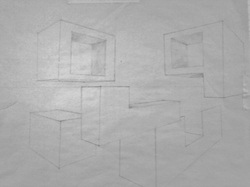 This is my first draft; it's just a drawing of cubes and other 3-D shapes. This was to practice and get ready for our other draft and final. I was successful because the blocks look like they could extend and meet up at two points, which would be in our periphrial vision.
 This is my second draft; its of a corner in one of the hallways at school. This is a 2-point perspective drawing because of the main corner, just off center of the drawing. The corner shows the walls going off in two separate directions. I could improve on this by drawing the ceiling tiles more realistic, and be more carful on my vertical lines, because some of them are a little side-ways.
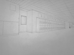 This is my final for the 2-point perspective drawing. This is a successful drawing because the corner is slightly off center. Just as my draft, it shows the walls extending in opposite directions. The drawing shows depth by all the lines being able to meet in two places, if they were able to extend fully, I could have improved my ceiling becuase it's not proportional or realistic. Also, I should have added the lines on the carpet floor.
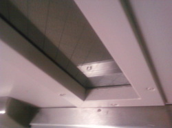 I had to walk around my high school during my period in art, and take photos of objects in weird angles. This is my picture of a door, looking down on the window and bar to open it with. This was actually the first photo I took, but I took several others because I didn't like it too much. Although, back in the classroom, after going through all the photos and asking others, this was the winner!
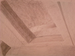 This my first sketch of photo I took (my assignment only called for one draft). This was done in graphite. I need to improve upon my spacing; my window is too wide. Also, my shading could have been better, but other than that, it's a fairly good sketch.
 This is my final drawing of my weird angled photo. It is drawn with charcoal, might I add, a VERY messy writing utensil. I accidentally made the same mistake of making my window too wide, but it is difficult to see it unless they are right next to each other, like one can see here. I believe my shading was done well though, I captured the light and dark areas of the photo. This was a successful drawing. :)
This assignment is similar to the "Line Movement"; I need to create movement and depth with shapes and/or patterns. The goals are to draw a pattern of a certain shape in different sizes to create a two-dimensional drawing that appears to be three-dimensional. If I am able to do so, then my final will be a sucess! 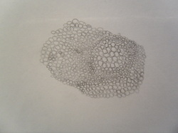 First Sketch I came up with my first sketch by drawing circle close together, then I thought to make them different sizes to seem as if they were getting farther away. I tried, and accomplished my goals in this first sketch, but in all honesty, I disliked drawing it because it was boring to me. So, to improve, I decided to come up with a new design that I would like to draw, since art is about expressing oneself.
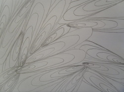 The second and third sketch just came out of nowhere, seriously. I kind of have a spiral idea in my head, but I didn't really want to do that because my circles would have to be almost perfect to look good. Then i just sort of drew this. I knew that to show movement and depth, the oval had to get bigger. The third sketch was when I came up with the idea, and the fourth, I improved upon it through organizing it a bit more by and drawing the shapes from a point to appear as if they were extending from that piont, farther away.
 Fourth Sketch  Final Drawing This is my successful final drawing because it protrays all the objectives needed for this assignment. When you look at it, your eyes instantly see these shapes extending close to you from a farther away point. It looks like there are shapes behind others as well, showing depth. I colored inbetween some of the sahpes with my pencil so it wouldn't look two-dimensional and above shapes were casting a shadow onto the ones below. And the best part about these shapes, I had fun drawing them! (:
The project was to create movement on paper by using only line. The goals of this project are to have different shades and thicknesses, without creating shapes with the lines drawn. I'll succeed by drawing the lines closer together and farther away, some thin and some thick. In this way, I can create depth in my drawing.
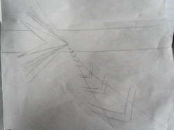 I came up with my first sketch by playing around with the lines; I wasn't really thinking of what to draw, I just let my imagination go. I wanted to show depth by having my lines go back into a single point, and make some large (not connected to the point) to look as if it was closer; also using shades to do so. I wanted to accomplish some great idea by without trying; but that didn't happen. I hardly met the goals of the project. I, without realizing it, created shapes. Also, I only used one thickness and one shade of lines.
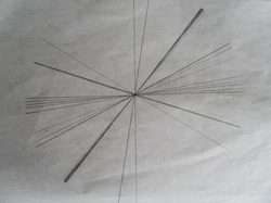 I came up with my second sketch by understanding what my objectives are more fully. I saw a similar drawing in an art book, but I took it and made it my own by simplifying it. I accomplished the goals needed for the project; the lines showed depth and movement. I didn't enjoy this project that much since it didn't come fully from my own imagination. I believe this sketch was mainly just to get my creative juices flowing.
 This is my third and final sketch. I enjoy simplicity, so I had the variety of line thicknesses and shades, but without so many lines drawn. To improve this sketch, I would probably need to add more lines, putting them really close together, then gradually spreading them farther apart.
 The masterpiece here, is my final result. It was based off my third sketch, but I made some changes. I had a greater variety of shades, and also added more lines. Although it is difficult to see, there are several more varieties of lines extending from the single point, making it seem like they are traveling away from the viewer. Also difficult to see, is my light shaded line that is really made up of many smaller, close together lines, making it seem far away as well. This is a successful project because the objectives clearly appear upon the paper. I drew a bold, very thick line to capture the attention, but also drew very thin lines which were even darker. Light shaded, very thin and thick lines are displayed across my design. And of course, one of the biggest reasons this drawing is so successful, is because Mr, Meserve himself approved it! :)
|
 RSS Feed