Calligram prints are prints of an image that are created by the use of words. The goal for this assignment is to create a calligram print that will be easy for a viewer to understand, and to use a good amount of ink as to not have too little or too much.
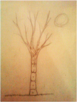
This was my first draft. I was trying to think of common sayings, and my friend thought of this, "knock on wood". It's kind of hard to read "knock" because its so squished together. I also decided to switch my design because I wanted it to be my own creation.
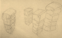
This is the sketch I came up with, "city that never sleeps".
Its not that well put to gether because its a draft. I like it because I enjoy the really tall buildings in the cities, with all the windows. Although, my final creation is different; the buildings are seen as if you were about the same hieght, and the windows are only on one side of the building.
Its not that well put to gether because its a draft. I like it because I enjoy the really tall buildings in the cities, with all the windows. Although, my final creation is different; the buildings are seen as if you were about the same hieght, and the windows are only on one side of the building.
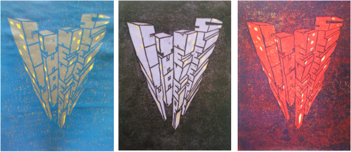
Here are some of my best final prints. I could have improved them by the amount of paint I rolled onto my block, You can tell if I used too much or too little paint because you can see the color underneath. Also, I made a mistake in my carving; in the word "sleeps", the first "s" wasn't carved to show the inside of the 3-D letter, so it looks like you can see right through it. But over all, I enjoyed doing this assignment and I think they turned out good.
.
 RSS Feed