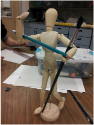
The assignment is to paint a picture of three things that relate to me and have something in common. I chose the theme art. I'll accomplish this goal by putting a pencil and paint brush on a manikin used for drawing. Here is a photo of how I put the pieces together, which I will paint.
Pay no attention to the background, only focus on the foreground.
My assignment is to paint a landscape that has a foreground, middle ground, and background. My goal is to show there is more detail in the foreground, and it will progressive lessen and colors will become lights as the viewer looks to the background. I will accomplish this by choosing a photo with these aspects and painting exactly what I see rather than adding detail to everything.

Here is the photo I will be painting. As you can see, the hills and trees in the background have much less detail than the trees in the foreground, making this
an acceptable photo.
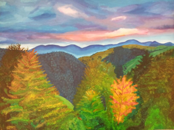
Here is my painting the the landscape. The photo made it appear lighter than it actually is. This is a successful painting because you can clearly see the depth of the trees in the foreground to the hills in the background. Of course, the painting also looks like the photo I had, which is a positive aspect.
My assignment is to create a pastel and charcoal portrait of myself, but it will be so blurred to where the veiwer knows its a face because of the shape and form. My goal is to use these two elements to create extremly blurred portraits, only recognizable as a face by common areas of shadows and higlights. I will do this by not paying attention to detail and using the ipad to transform my face into one that's blurred.
For my first drafts, I took a photo of myself and used an app to blurr my face. I them turned the ipad upside down so that I wouldn't be focused on drawing my face, but rather focused on the movement of the lines and the hilights and shawdows. I tried to accomplish drawing myself in way so that you only know it's a person but not specifically me. I'd improve by blurring the edges between the dark hair and the skin, to make the change less defined.
Here are my finals of the two blurred portraits. These accomplish my goal because although they do not actually look like a face, the veiwer sees a face within the blurred colors and shades. These are successful portraits because I used highlights and shadows correctly to create portraits that resemble a face, even though no detail was added.
The assignment for this project was to color (paint, oil pastels, etc.) a self portrait with an intense emotion on my face. My goal is to have the veiwer recognize the emotion I'm portraying through my masterpiece. I will suceed by carefully drawing the creases and darkening the showdow areas of my face.
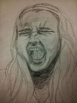
I came up with this sketch my thinking of the most intense emotion, which I think is anger, so I pretended to be screaming out of anger. I tried to accoplish making a 2-D face appear angry and 3-D through the use of shading. The eye area could use some improving; shade better and capture the natural eye wrinkles.
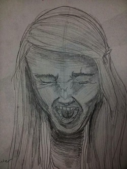
This sketch was made by using the same expression, but moving my head to a different angle. I actually don't think this sketch is better than my first, but it's good considering it shows the shadows and highlights in different ways. The nose could of have been shaded better and drawn more proportionately. Also, the eyes are a bit far apart.
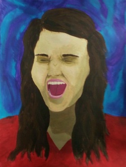
This accomplishs the goals set by showing depth with shadows and highlights, although, I'll admit that there should have been more shading. Even though it still looks a little 2-D, this was a successful painting. It's a portrait of myself with an angry expression, which is clear. Some depth is shown with the different colors for the shadows and highlights. You can see the hair isn't one solid color.


 RSS Feed