The assignment is to listen to a song, and to paint whatever comes to mind. I am not able to paint actual objects. Instead, I need to paint lines, and use colors that go well with the song; for example, a happy song would use warm colors. I'll succeed by painting the feelings of the song, rather than objects.

This is a practice sketch that I created using one of Mr. Meserve's song he played. The song was a mixing of both light and dark feelings, so I used all colors. It wasn't a smooth tune either, which is why I painted lines that were wiggly or jagged. I could improve by filling up more of the white areas, and also, by blending the colors more, instead of leaving them in their own area.
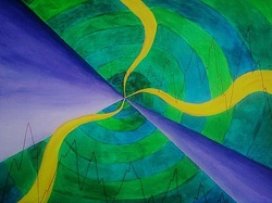
This is my final, and I created it with the instumental version of the song, Sail by Awolnation. The song had mostly a darker feel to it, though there were some parts that lifted up a bit, hence the cool colors, besides the yellow curved lines. Also, the music was pretty soothing, except for a couple of movements, which is why I added the zig-zag lines. The purple shades striking out from the center create a smooth, but sharp look. Also, the swirl to the center represents how the song captures you.. This was my first sketch (I lost the paper I drew it on), and I really like this creation and think it is very successful.
Calligram prints are prints of an image that are created by the use of words. The goal for this assignment is to create a calligram print that will be easy for a viewer to understand, and to use a good amount of ink as to not have too little or too much.
This was my first draft. I was trying to think of common sayings, and my friend thought of this, "knock on wood". It's kind of hard to read "knock" because its so squished together. I also decided to switch my design because I wanted it to be my own creation.
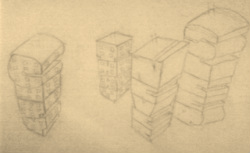
This is the sketch I came up with, "city that never sleeps".
Its not that well put to gether because its a draft. I like it because I enjoy the really tall buildings in the cities, with all the windows. Although, my final creation is different; the buildings are seen as if you were about the same hieght, and the windows are only on one side of the building.
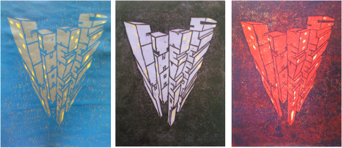
Here are some of my best final prints. I could have improved them by the amount of paint I rolled onto my block, You can tell if I used too much or too little paint because you can see the color underneath. Also, I made a mistake in my carving; in the word "sleeps", the first "s" wasn't carved to show the inside of the 3-D letter, so it looks like you can see right through it. But over all, I enjoyed doing this assignment and I think they turned out good.
.
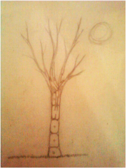
The assignment is to create my own version of an Eyvind Earle painting. The goal is to not copy one of his masterpieces, but using the same techniques he uses. I'll be successful by accomplishing the goals and using small dots to create texture and depth.

This here was my first sketch. I thought of this idea by just going through some of his work, trying to get a feel for what my task was. His work mostly constisted of landscapes and trees. I liked the idea of it, but I felt it was too squished and needed to be changed. So I improved it by making it horizontal, and adding in more objects.

This is my second sketch, which is also the sketch I used for my final. I added a tree trunk in the foreground, and hills in the background.This looks like Eyvind Earle's work because of the round trees, hills in the background, and the trunk that is in the forground. I definitely like this layout better.

This is my final piece. While painting it, I had made some changes. The tree trunk only has one limb coming off of it, and there aren't so many trees (I wanted to keep it simpler). I think I could have improved my grass, made it a little darker by the trees to show depth, and maybe added dots as well.This is successful because it's my creation, but it has the technique of Earle, especially with the tree trunk and shape of the trees behind.
 RSS Feed